pronolagus.com
Marcus Harwell – all the online things
news & updates:
We’re posting fast & furious (for me, anyway)! More drafts as I clean up & edit them.
social media, etc.
-
National Poetry Month
There’s finally a new newsletter going out. As long as it’s been since I wrote a newsletter, though, I think it’s even longer since I wrote a poem. April is a change month, I guess. Outgrowth Endlessly, endlessly, routing our hearts through our heads in concert,rhythms both natural and constructed.There’s the pounding and hammeringthat drives…
-
Linkdump for the Garden

In the spirit of making the site more a digital garden than a blog, I collected a handful of the ridiculous number of videos I rammed into my brain the past week and seemed worthy of keeping around. Loosely grouped, they’re in these topics: Gaming Quintin Smith of the tabletop game review channel Shut Up…
-
Cory Doctorow at Powell’s
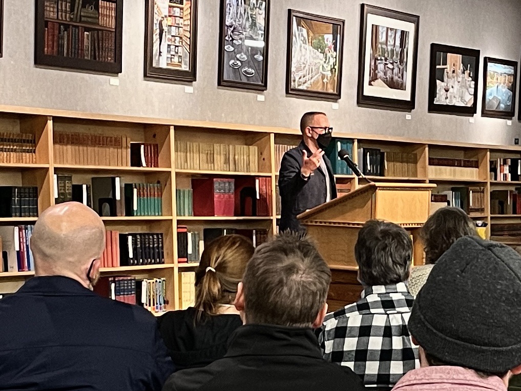
I had to race downtown after an exhausting day the minute I got off work to make it to Powell’s Books, and I was late for the start. Cory Doctorow is in the middle of a book tour for his novel The Bezzle, and he had already started a short lecture when I arrived in…
-
Having Re-Read Lord of the Rings
In late fall of 2023, I decided to focus on finishing the task I’d started late the year before and abandoned: a close reading of Lord of the Rings. Previously, I’d read in chunks and in referenced fits. That is, I’d see a video or read a friend’s text about some LotR aspect and want…
-
Pause, Unpause
It’s taken longer than I intended to get back to posting, but since the pandemic began, and still, time is more fluid for me than it used to be. As always, there are half-finished projects piling up in the wings, not yet ready for the stage. For now, I’ve added a music section and started…
-
Geese!
I’ve been obsessed with the new Geese album, 3D Country, this past week. It’s like this crazy stew of Lynyrd Skynyrd, Kings of Leon, the Doors, and X. But then again, not quite. They are their own thing, which we all should aspire to be. The friend who linked me to their record offered Steely…
-
Hello world! Again!
This is the shiny new warehouse for Marcus Harwell’s work online. Apologies if this is disappointing. I’m working on getting things up and running, BRB